
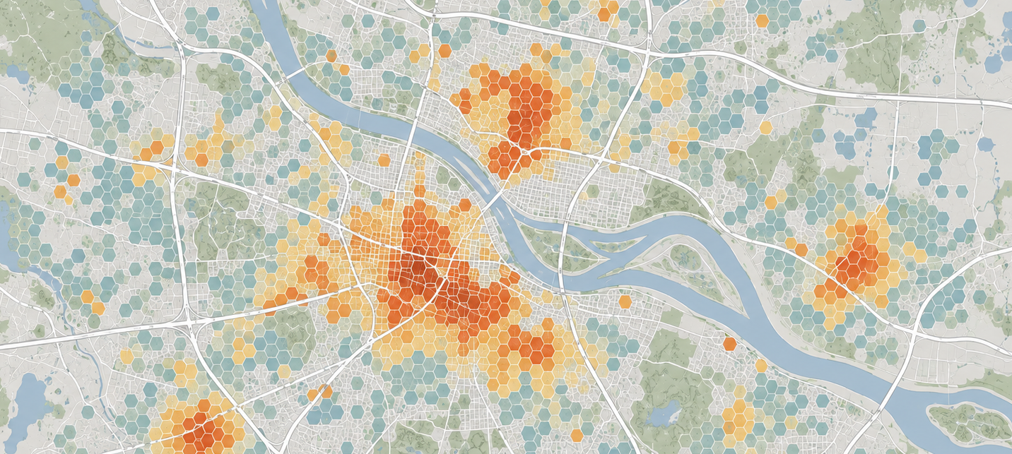
Every major location decision in retail, telecom, and real estate starts the same way: someone commissions a geospatial analysis. Competitive density, demographics, drive-time polygons, maybe a gravity model. The output is a heatmap. The heatmap gets squinted at in a meeting. The meeting confirms a decision that was probably already made.
The Heatmap Problem
Geospatial analysis for business decisions has always had the same structural flaw: it counts the right things at the wrong resolution and calls it insight.
Should you build the next Starbucks? What's your market share in Phoenix metro? Should you differentiate pricing across regions? Is the business underperforming in certain geographies, or are certain geographies underperforming the business?
These are real questions. The tools we use to answer them are not up to the job.
Census blocks that don't correspond to how anyone actually lives or moves. Geographic hexes where a single cell includes downtown San Diego and Lindbergh Field. Demographic data that doesn't know the younger population clears out of Lynchburg, Virginia every summer. Competitive counts that say "three competitors" but can't tell you all three are buried in dead malls with no foot traffic.
A choropleth heatmap that shows a hex as "3/5 penetration" gives you a color. It doesn't give you conviction. You can't deploy capital on a color.

What Changed
The data got better. Meaningfully better, across several dimensions at once.
Satellites now do daily passes. Hedge funds have been using high-resolution aerial imagery for over a decade to count cars in parking lots and drive outsized returns. The technique is well-documented. That was version one. Version two is everything that's layered on top.
Semantic text: what people are saying about businesses, about neighborhoods, about living somewhere. Social media chatter. Forum complaints. Review sentiment over time. Search interest data that reveals what people want before they buy it. Permit filings and construction activity that tell you whether a place is growing, stable, or dying. Satellite imagery that shows whether new factories are being built or abandoned.
None of this data is new individually. What's new is the ability to compile it into a coherent narrative about a place, fast enough and cheaply enough to do it for hundreds of places at once.
From Color to Conviction
Data for data's sake isn't that exciting. Another dashboard with another layer toggle doesn't change decisions. What changes decisions is the ability to double-click on a color and find out what's actually going on.
Take a supermarket chain looking at regional performance. The heatmap shows moderate penetration in a market with five competitors. That's a shrug. It could mean anything.
Now double-click. The satellite imagery shows three of those competitors have empty parking lots at peak hours. Review data reveals customers calling two of them unsafe. A fourth is surrounded by road construction that's been ongoing for eight months. Meanwhile, a new residential subdivision three miles south added 400 homes in the last year, and the nearest grocery option is a dollar store.
That's not a 3/5 hex anymore. That's a market where you're overperforming against deteriorating competition with an expansion opportunity nobody else has noticed. Or it's the opposite. Five thriving competitors and a population that's about to decline. Either way, you know something the heatmap couldn't tell you. You have conviction instead of a color.
The Fixed Wireless Operator
The supermarket example is intuitive. Here's one that shows the real analytical edge.
You're a regional fixed wireless operator deciding where to put the next tower. You have rural markets that fiber hasn't reached, but fiber is creeping closer every quarter and Starlink is eating low-hanging demand from above. You know geospatial. You run viewshed analysis on every candidate site to optimize coverage.
What you're not doing is layering in actual supply and demand signals.
Social media and local forums tell you how frustrated current users are with whatever they have today, and whether the incumbent ISP's service is deteriorating or improving. High-resolution aerial imagery shows how many Starlink dishes are already on roofs, which is a direct read on how much of your addressable market has already been captured by the thing you're racing against. Permit filings, new construction activity, and revitalized forestry operations tell you whether the area is growing, stable, or withering.
An underserved hollow with expanding forestry activity, angry users on the local Facebook group, no fiber build announced, and few visible Starlink dishes is a completely different investment from a similar-looking hollow where half the roofs already have dishes. The viewshed is the same. The signal environment is the same. What you know about the place before committing seven figures to steel and electronics is not.
The Gap
The tools to do this exist. The data exists. The compute to synthesize it exists. LLMs can read thousands of forum posts and reviews, extract structured sentiment, and map it to specific locations. Satellite imagery providers offer daily refresh rates at sub-meter resolution. Construction permits and business filings are increasingly digitized and API-accessible.
What doesn't exist, yet, is the standard practice of doing it. Most location intelligence workflows still terminate at the heatmap. The analytical layer that turns geographic data into place-level narratives, that tells you not just what the numbers are but why they look that way and whether they're about to change, is largely unbuilt.
The company that builds it won't just have better data. It will have better questions. Instead of "what's our penetration in this hex," it's "what is actually happening in this place, and what does that mean for us?"
That's the difference between a heatmap and a decision.
Read more about our Terrain Lab here.